Phase 1: Establishing an Identity
The Arvada Western Railroad’s brand identity began with the use of the Montserrat font, a modern, geometric sans-serif typeface inspired by early 20th-century urban signage. Its clean, symmetrical lines and consistent proportions made it an ideal choice for creating a cohesive and standardized look across locomotives, railcars, buildings, and other assets. Montserrat struck a balance between modern simplicity and subtle style, remaining highly legible and visually neutral without being bland.
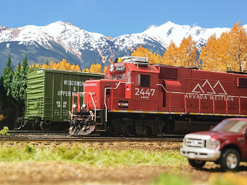
The railroad’s original logo featured three mountain peaks, a visual nod to Colorado’s Front Range and the sweeping skyline visible from the western edge of the Denver metro area. This imagery helped root the Arvada Western firmly in its regional landscape.
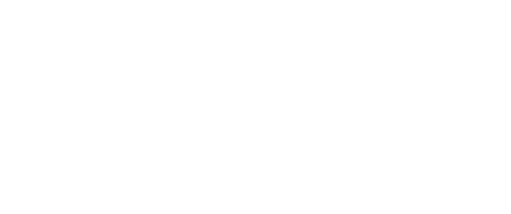
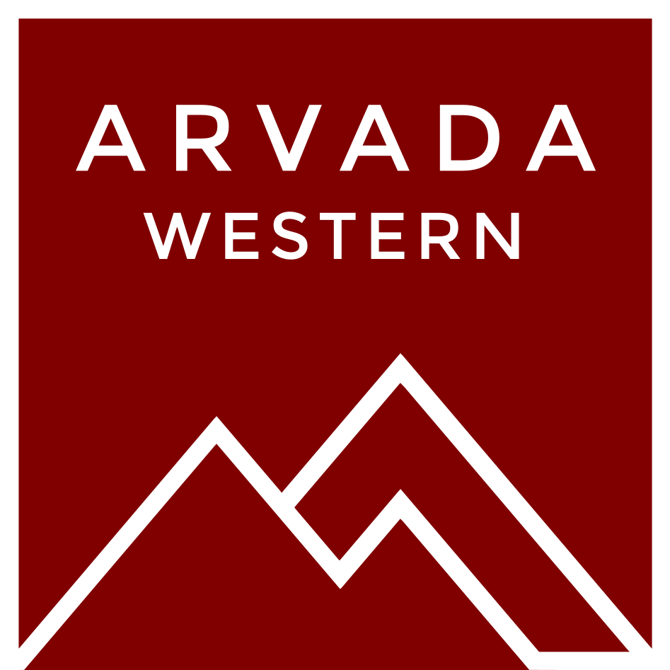
Red was selected as the primary brand color—both for its bold, attention-grabbing presence and its deep connection to Colorado’s identity. The name “Colorado” itself comes from the Spanish word colorado, meaning “colored red” or “reddish.” In this context, red symbolizes more than just visibility; it reflects the natural beauty, endurance, and cultural heritage of the state. On the Arvada Western, red evokes a sense of authenticity, passion, and regional pride—making it more than just a design choice, but a meaningful statement.
Phase 2: A Unified Evolution
As the Arvada Western Railroad expanded and became further established across Colorado’s Front Range, a new chapter in its visual identity began.
The Montserrat font was replaced with the iconic and timeless Futura typeface, offering a sleeker and more contemporary visual presence. Alongside this transition, the original three-peak logo evolved into a streamlined, modern emblem, designed to reflect not only the Arvada Western but also its affiliation with other railroads under the Sur Rail O&M division, including Sur Rail Leasing and the Los Alamos Northern Line Railroad. The peaks once separated are now connected together. This visual overhaul helped unify the look and feel of the entire operating group.
While Phase 1 used a generalized shade of red, the Phase 2 scheme introduced a more specific and meaningful tone: CB&Q Red. This vibrant red color is a tribute to the railroad’s heritage, referencing the former Colorado & Southern lines that eventually became part of the Chicago, Burlington & Quincy Railroad (CB&Q). With this color shift, the Arvada Western visually linked its future with its historic roots, creating a brand that honors the past while moving forward with purpose.